Past Inspiration.
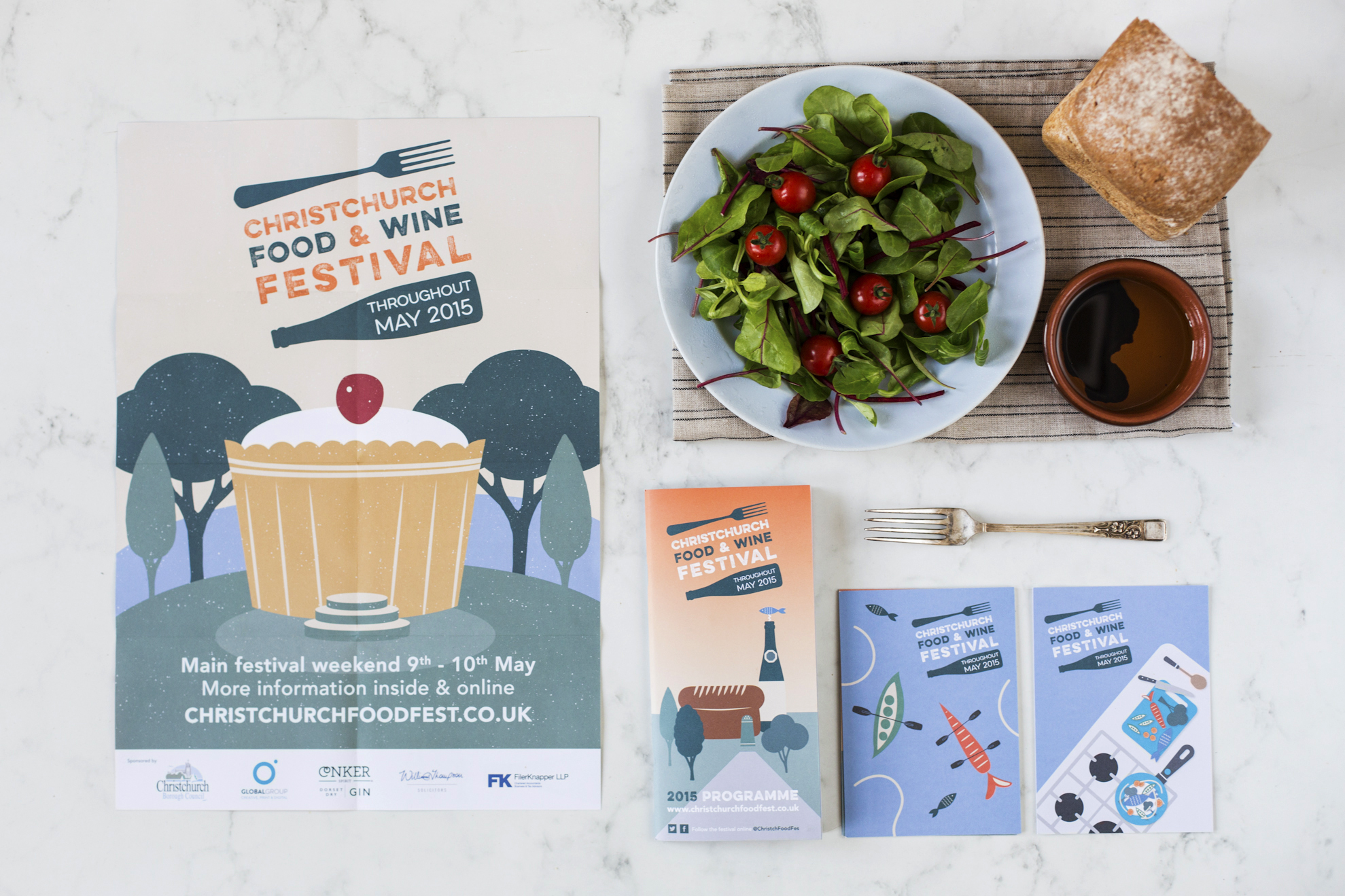
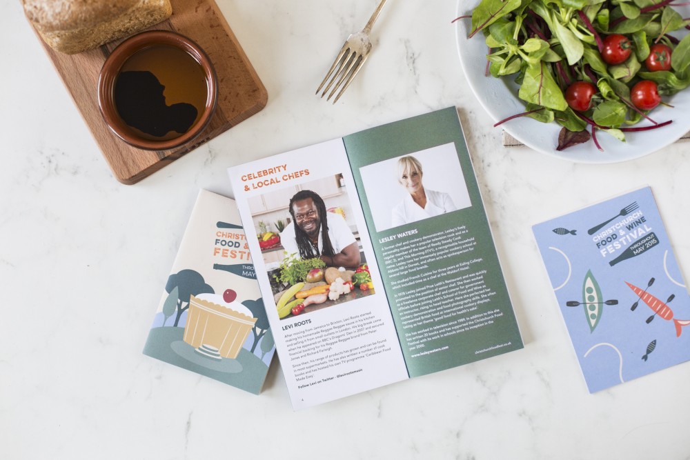
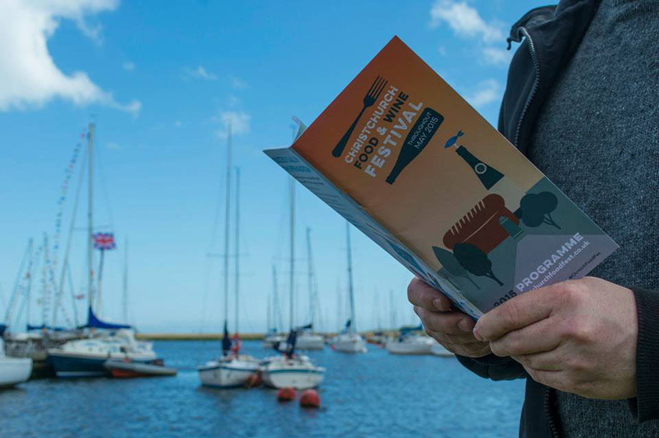
We worked with Christchurch Food Festival to refresh the brand with a new look for the 2015 event, designing and printing a range of materials to promote the festival that would appeal to a broad target audience.
Christchurch Food Festival has gone from strength to strength, and it was time to add some depth to the existing brand to reflect the success of the festival.
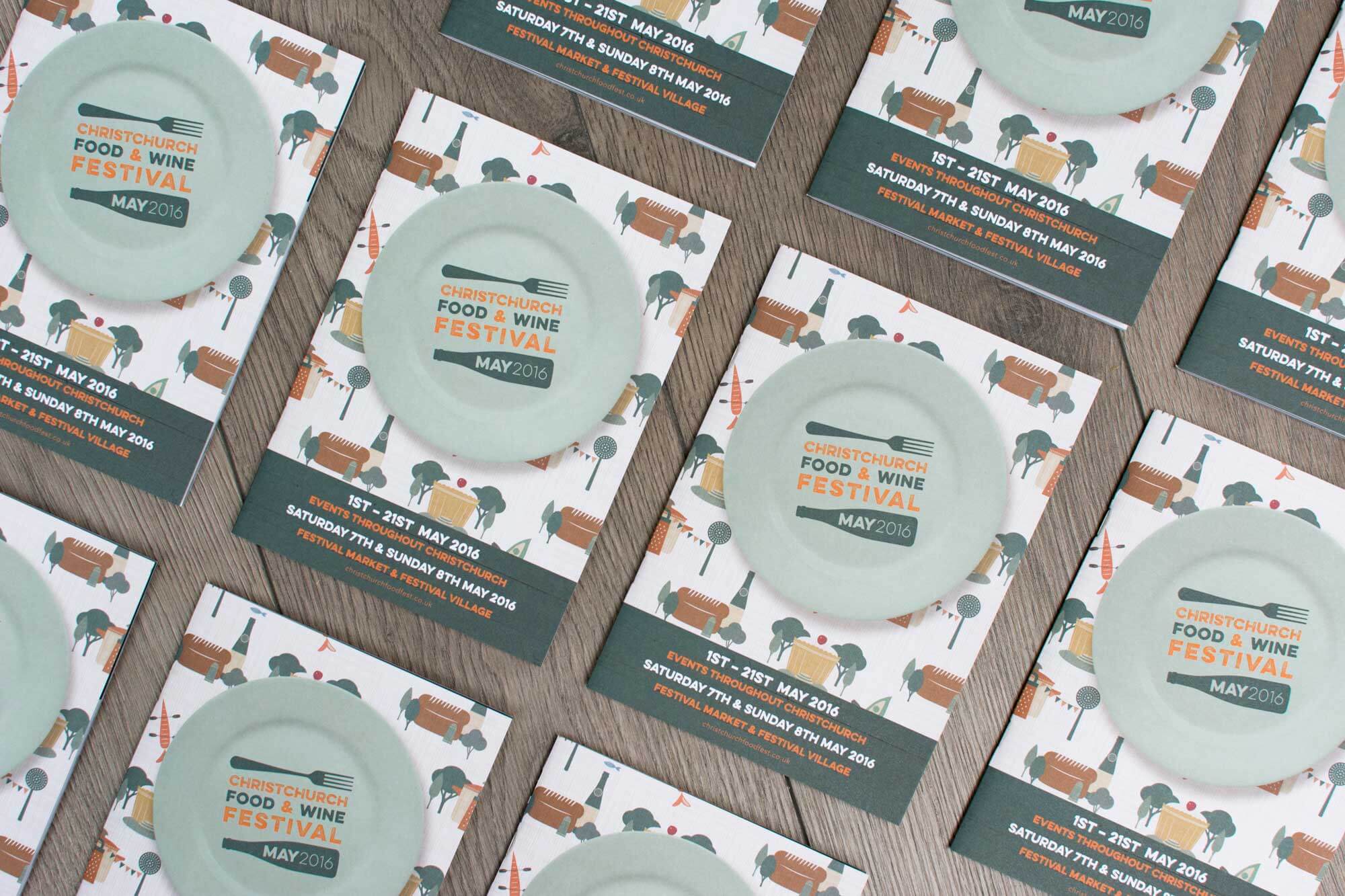
We updated the identity for an already successful festival and created a marketable and memorable brand that could be rolled out across merchandise and promotional material. We wanted a vintage look for the festival to evoke history and heritage.
Future Creation.
A soft sans serif font, playful illustrative elements and lively colour palette were selected to appeal to a broad and inclusive demographic, predominantly focused on families, foodies, tourists and locals. Local landmarks were recreated using stylised illustrations of food and drink.

The Destination.
We recreated local landmarks using stylised illustrations of food and drink.
Christchurch Priory was made from bread, wine and fish as reference to Christianity. The fish is also a reference to the salmon weathervane on top of the Priory, a unique feature symbolising that the first salmon of the year was always given to the prior.
The bandstand was recreated as as a cupcake to symbolise the ‘bake off’ element of the festival, which takes place near the bandstand.
The Rivers Avon and Stour were represented as a soup, with peas and carrots portraying rowing boats and noodles used to create ripple effects.

