Case Study Eightwealth Management
The Journey with Eightwealth Management:
Making a growing SJP partner, distinct.
Scroll To Discover More
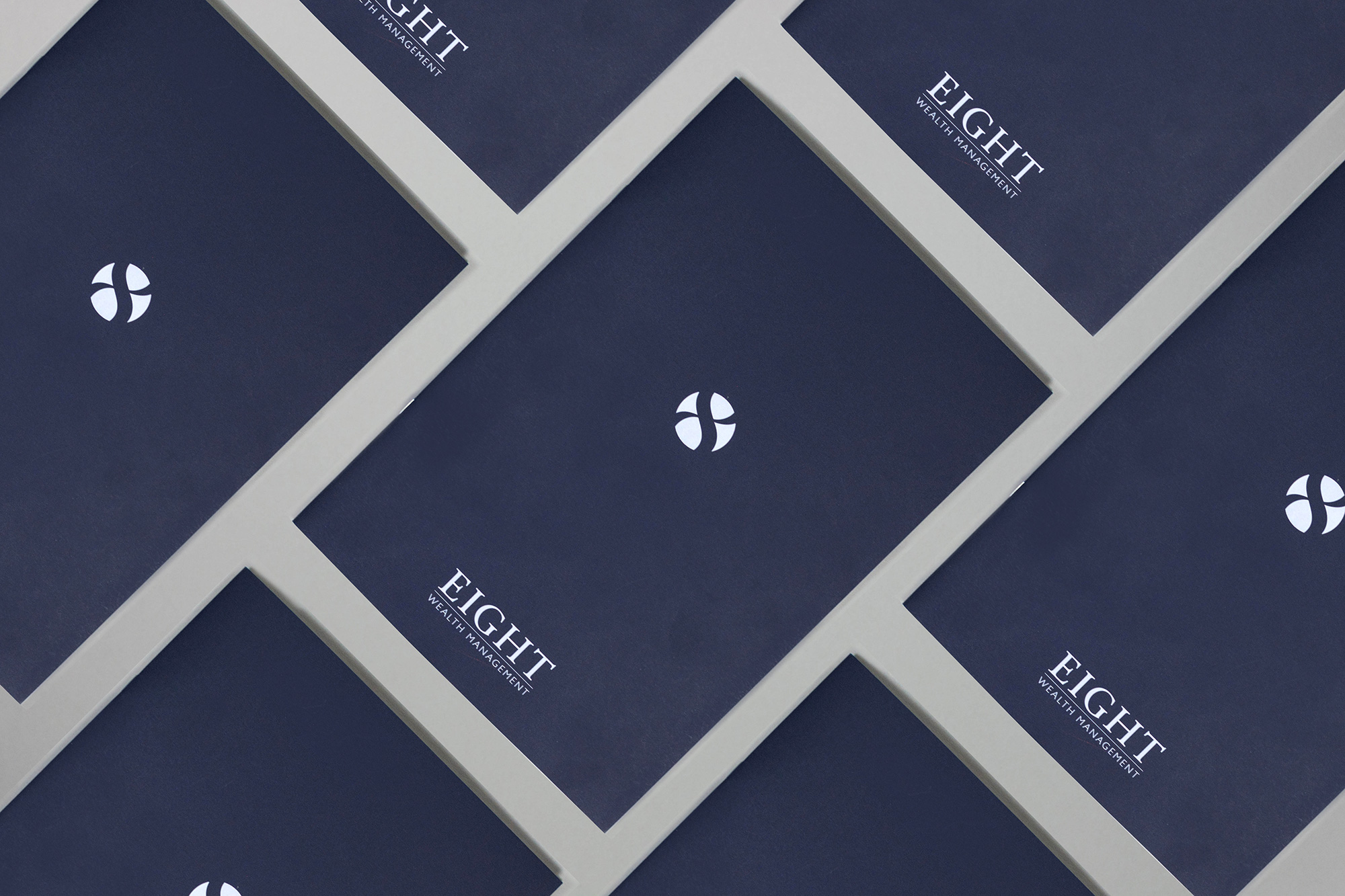
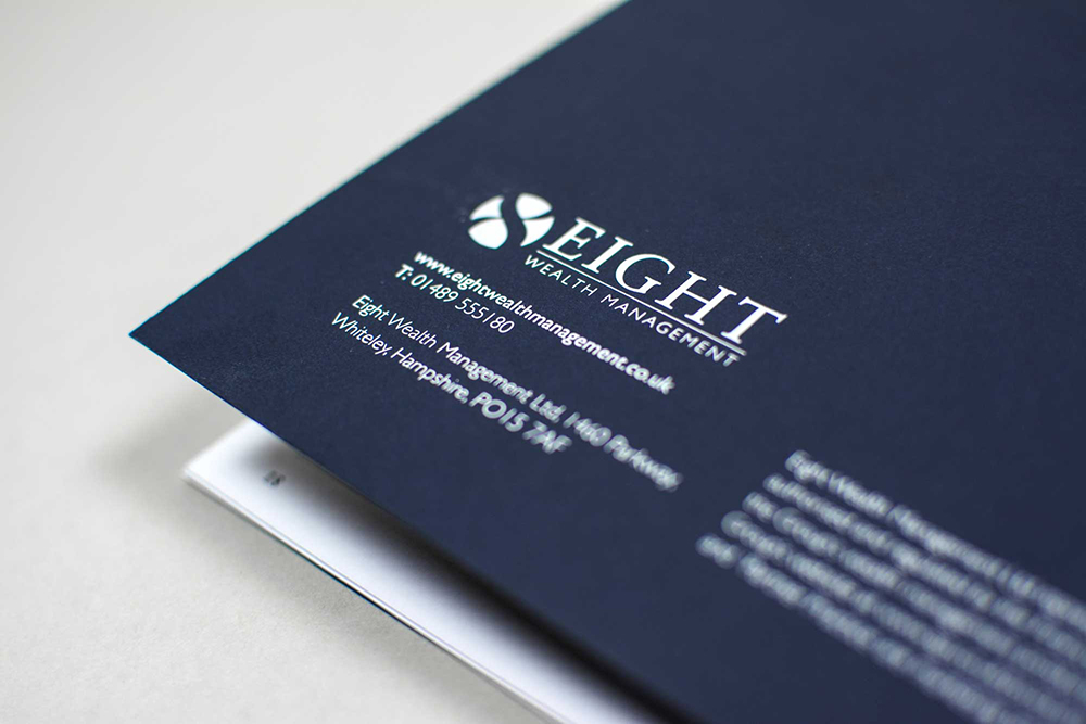
The Famous Eight. The core issue that Eight Wealth wanted to address was that their previous logo was not effectively communicating the name of the business. Feedback found that the numerical ‘8’ wasn’t clearly seen as part of the logo and so most people would only notice ‘Wealth Management’. The key approach was to address this and design something both clear but aesthetically engaging to potential clients. It was imperative to delve into the DNA of Eight Wealth Management and represent their personality.
The journey of evolution begins. The approach that Global took was to create a brand new wordmark, or typographic treatment that represented the company. The numerical ‘8’ was retained but reworked into an icon that could be understood and used both individually and together with the wordmark. A typeface was selected which was both contemporary but classic. This combination was chosen as the perfect fit with the Eight Wealth’s long-standing experience and expertise, whilst also reflecting their desire to evolve. This is also demonstrated within the chosen colour palette. The dark blue tones are representative of a sophisticated and grown-up brand, who are approachable and professional, in-keeping with Eight Wealth’s personality and tone of voice. Candid photography of both the Eight Wealth team and their contemporary offices has helped to further illustrate the brand personality across all print and digital collateral including brochures and their relaunched website.

We have a real depth of experience within the Financial sector. We have been honoured to work with giants Williams de Broë, Investec and St. James's Place. Eight Wealth Management is an excellent example of making a growing SJP partner, distinct.


